Design Narrative
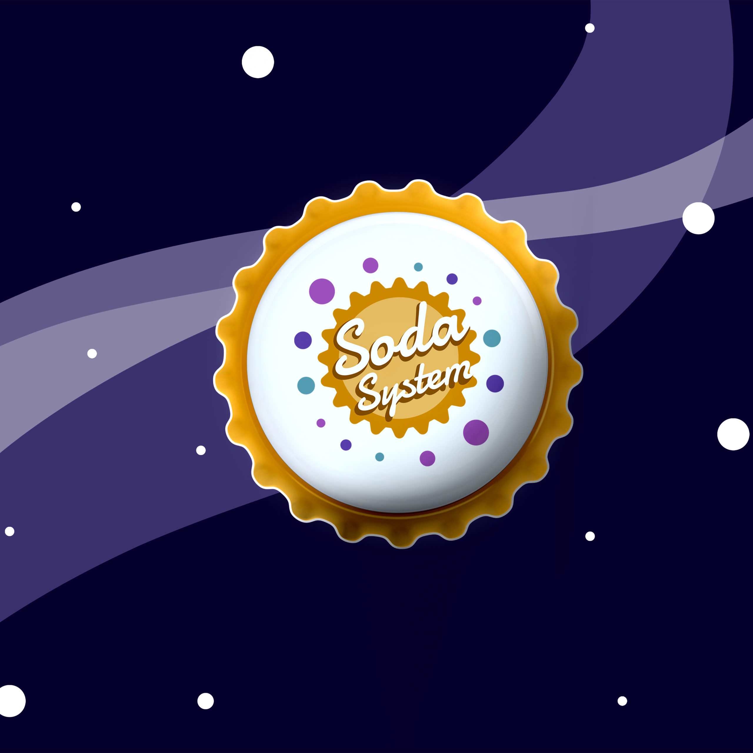
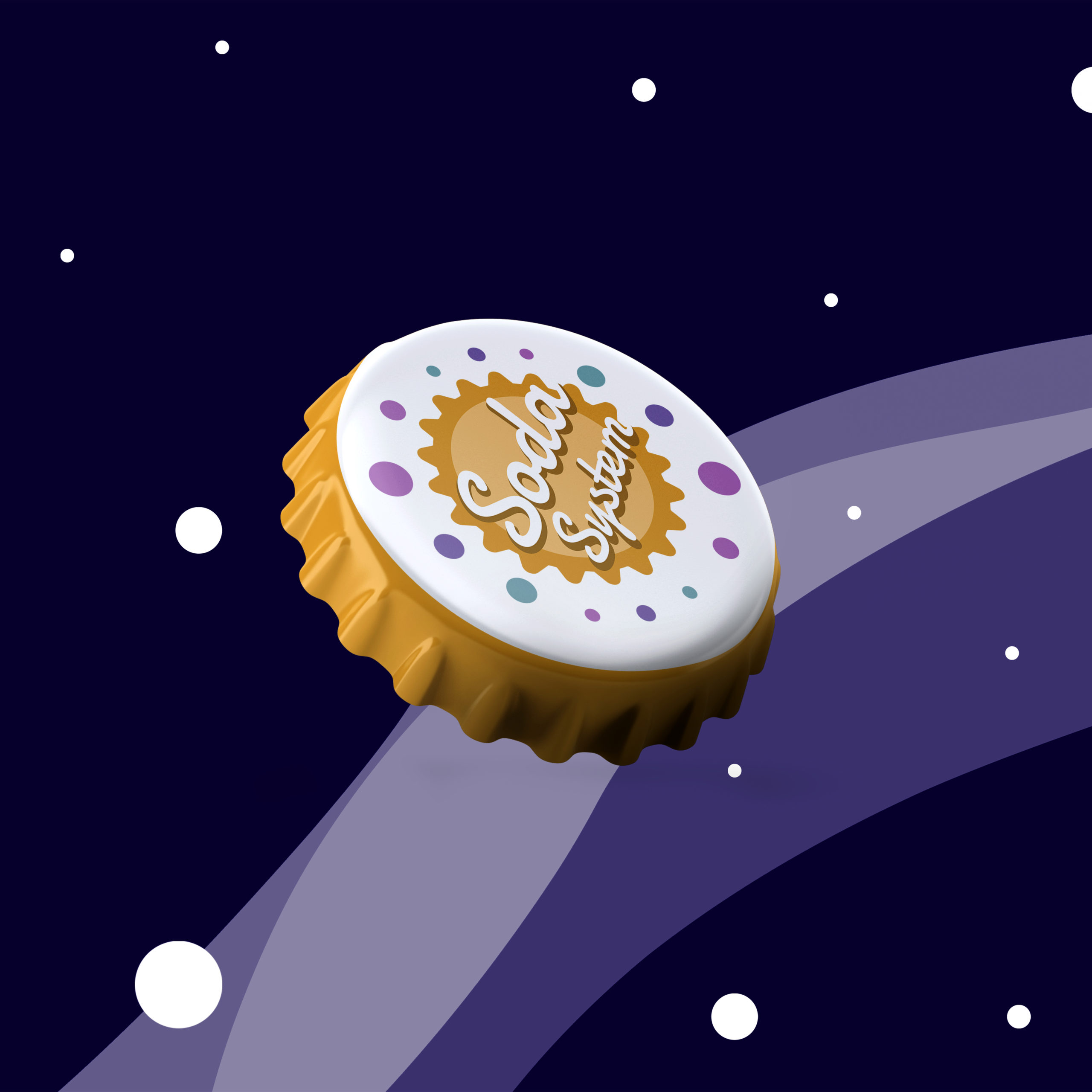
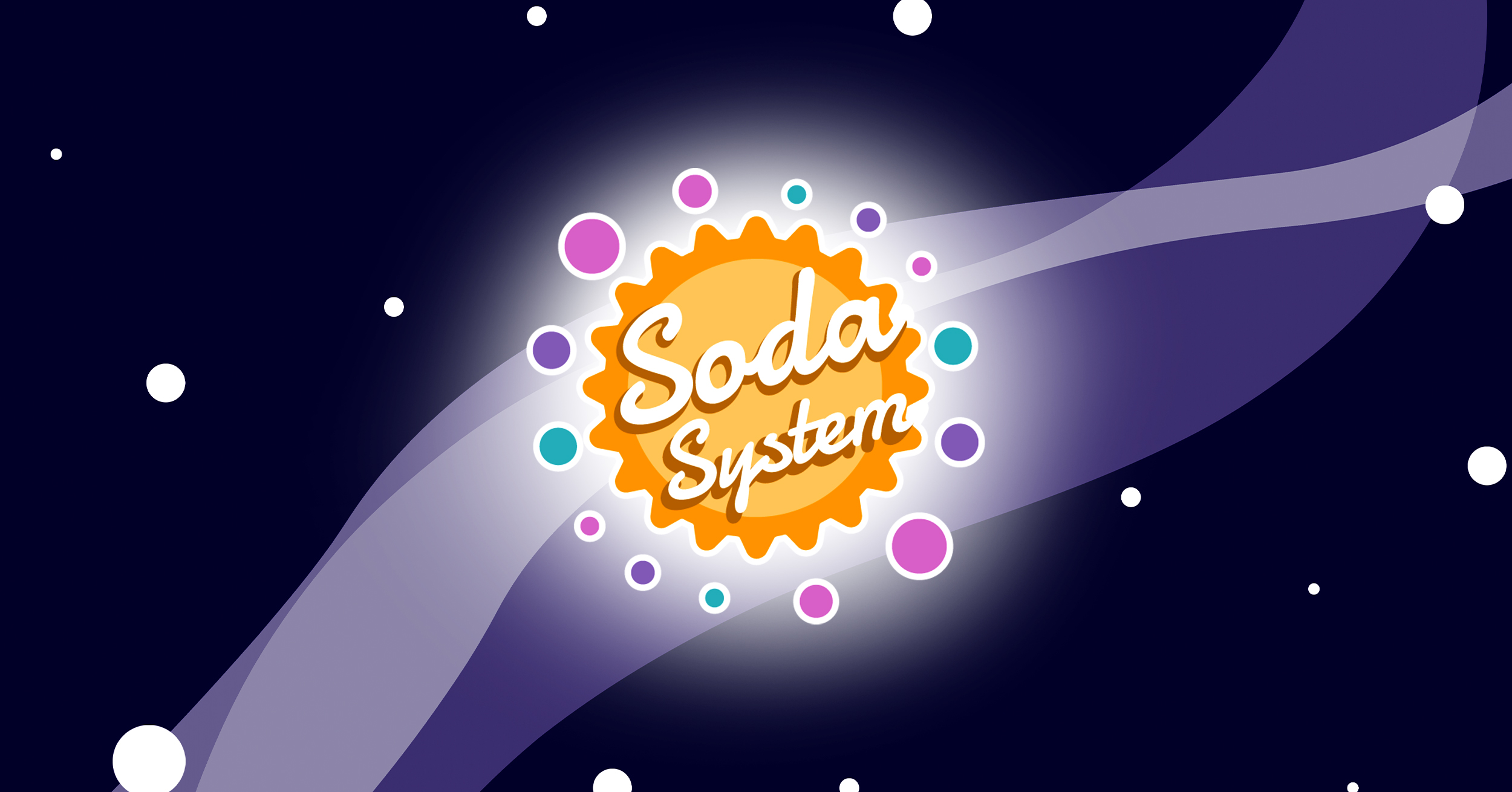
Soda System is a fictional brand that offers soda pop beverages with a unique galactic twist. The target audience for this brand is preteens to young adults in their 20s. The challenge was to redesign this brand. This company was one of the first I had designed so it was time to give it a new look. The redesign was carried out to incorporate simple rounded shapes, and elements of the soda bottle were also referenced. Inspiration for the new design went back to the original references from soda pop/diner designs from the 1950s. The resulting icon is both playful and dynamic by using an orange bottle cap shape as the sun and colorful circles of varying sizes to symbolize bubbles and planets. Imagery creates a solar system, or should I say, a Soda System.
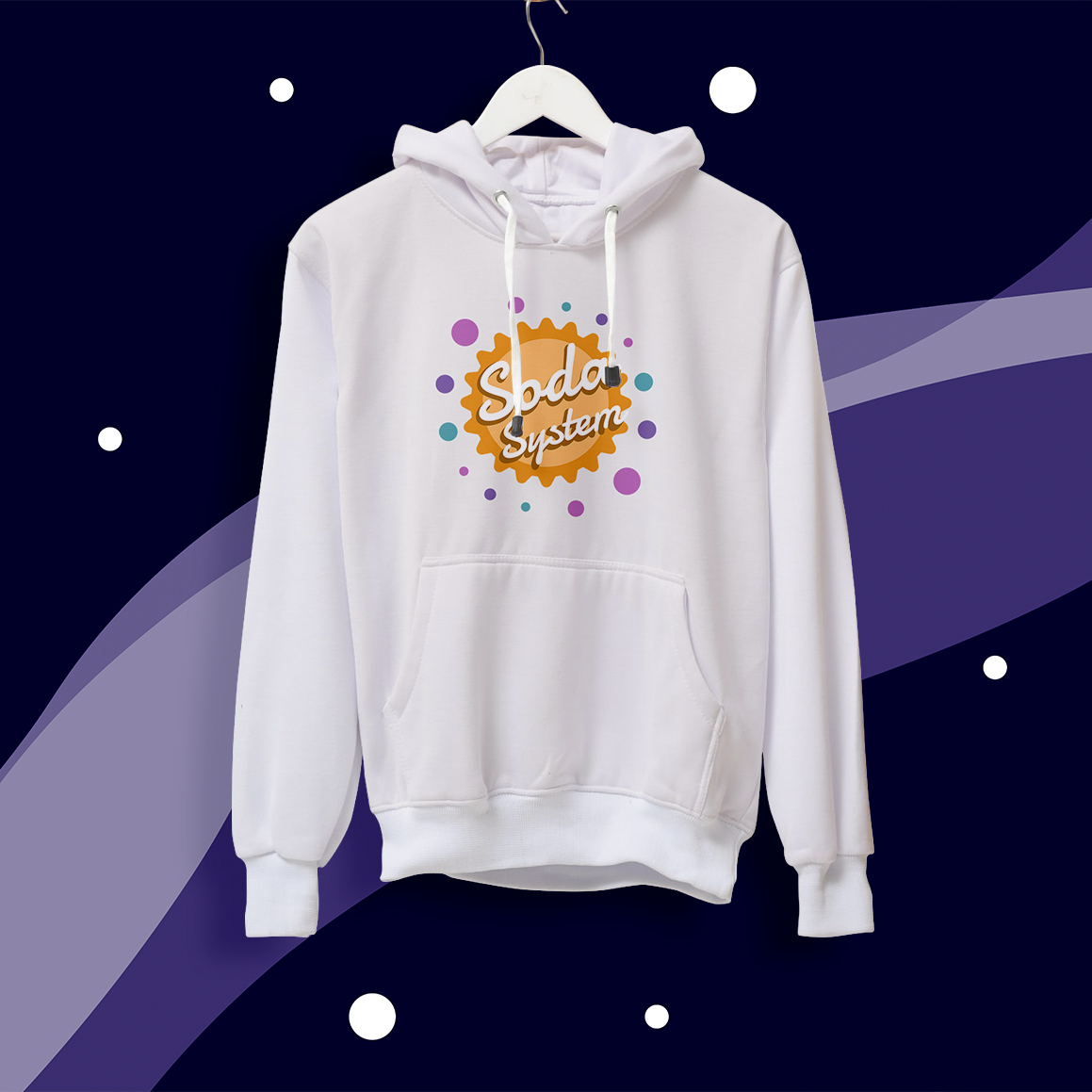
To create a new and vibrant look, a color palette consisting of blue, pink, purple, orange, and yellow was developed. To connect planets and bubbles, the circles were made to orbit around a sun bottle cap to create that callback. A cohesive font was used for the logo, with just one typeface, that mimicked the inspiration aesthetic. A dynamic dark orange off-center outline was placed behind the font to make it appear to be coming off the logo icon behind it.
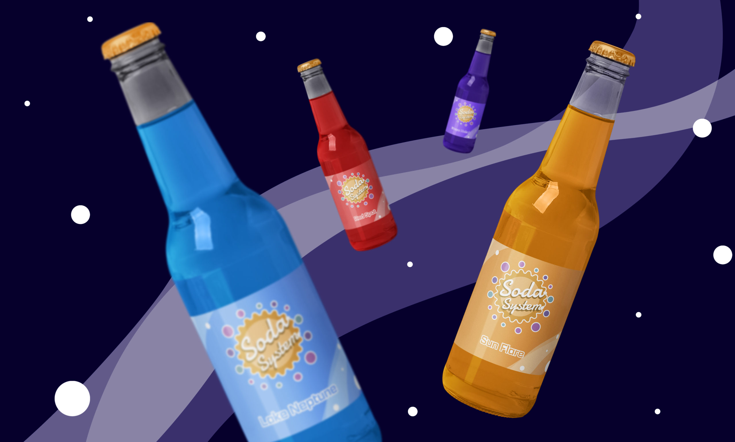
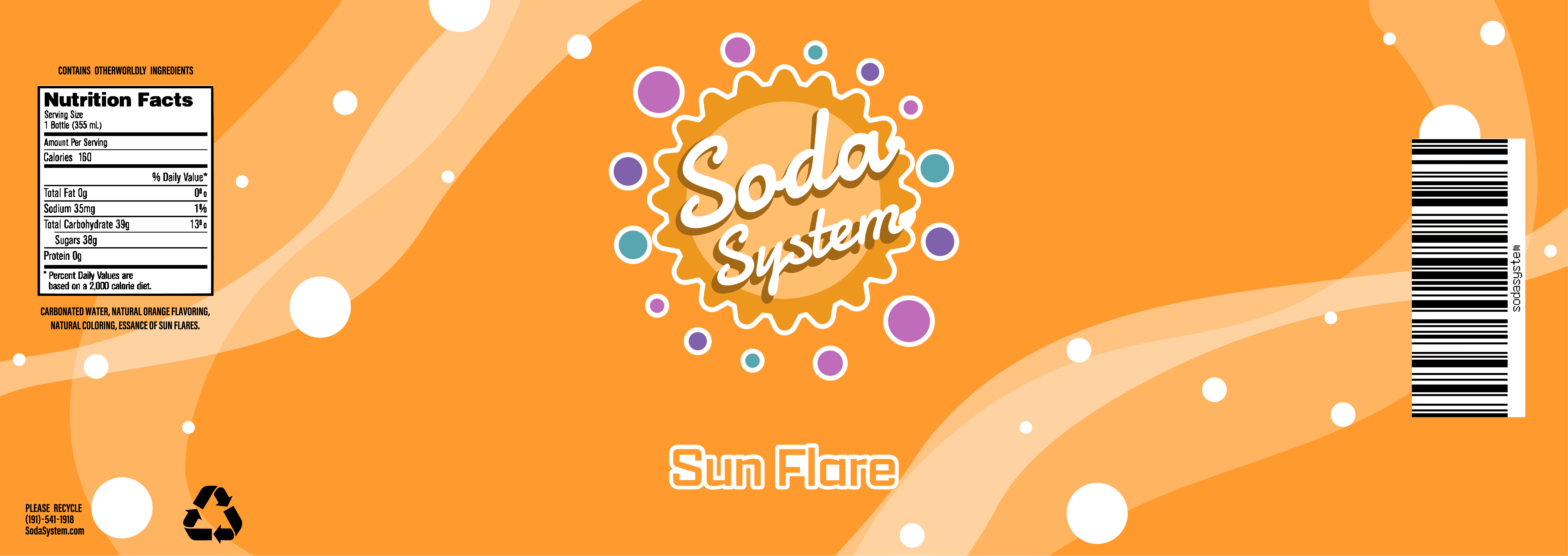
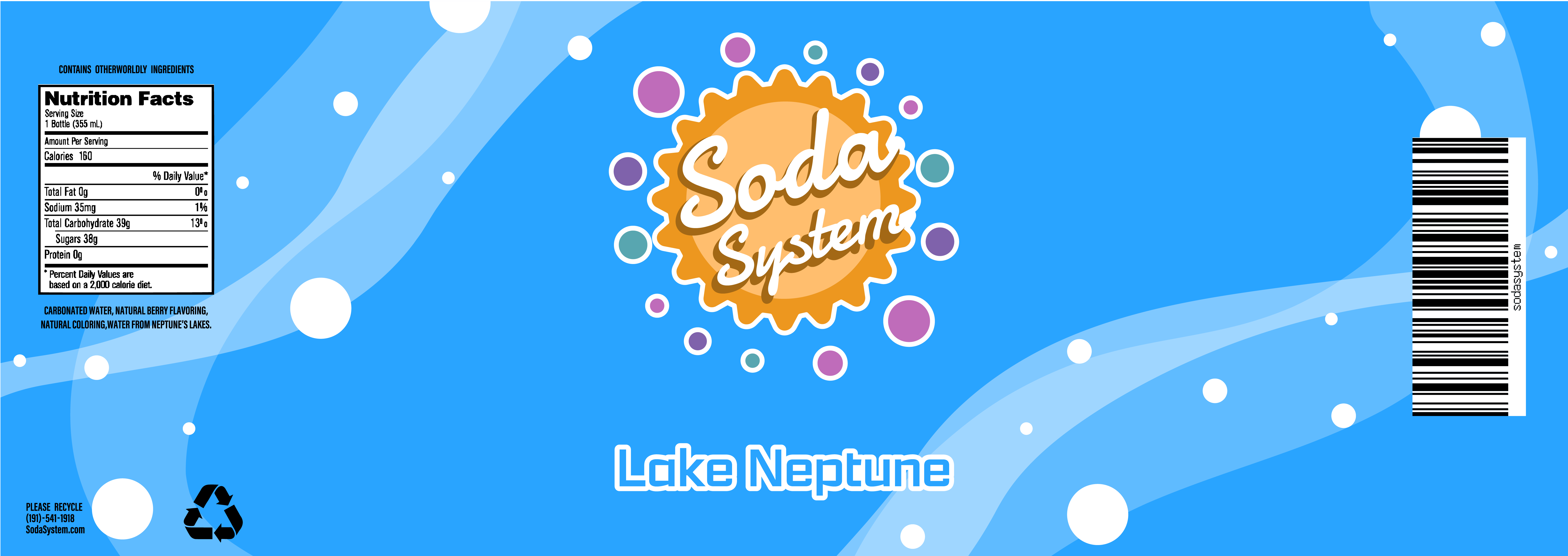
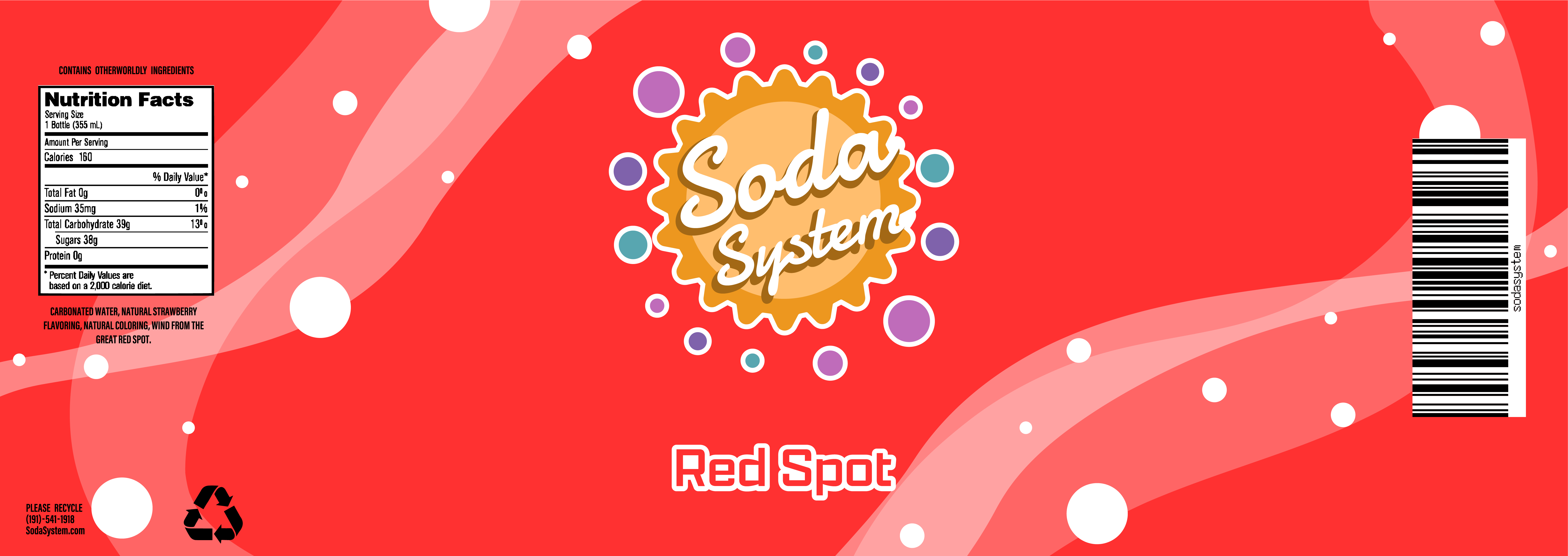
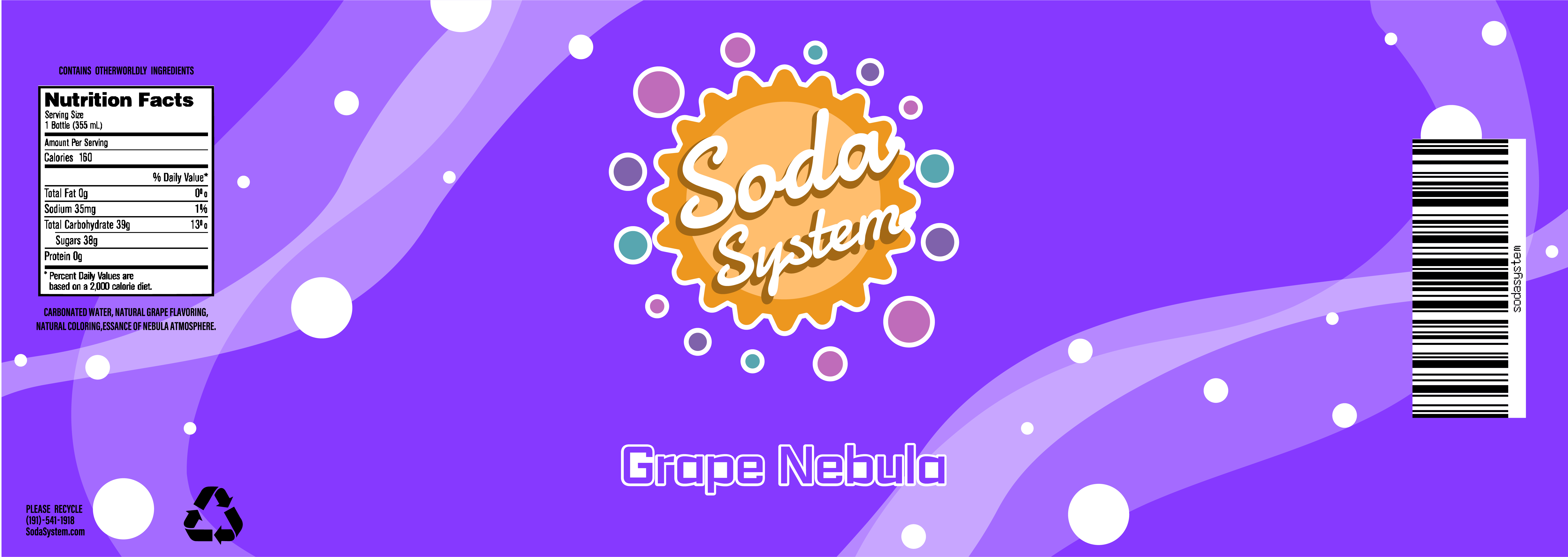
Each soda bottle label was designed to match the color of the drink it represented. Flowy lines were used as a standard background in all the labels, which represent the soda, and circles were also used to call back to the logo. Overall, Soda System is a brand that sells soda pop beverages with a unique galactic twist in a playful and dynamic manner.
