Design Narrative
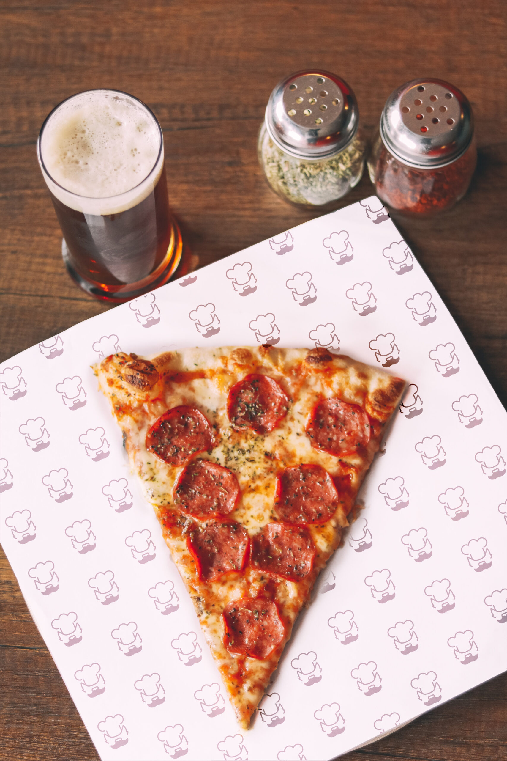
Papa Wolf’s is a hypothetical classic pizzeria that serves its pizza from an authentic brick oven. With a focus on quality ingredients, traditional recipes, and friendly service, Papa Wolf’s is a beloved neighborhood family restaurant. The challenge was to redesign this brand from in former look. The goal was to bring a playful yet established energy to the company and make it a place where everyone could go eat.

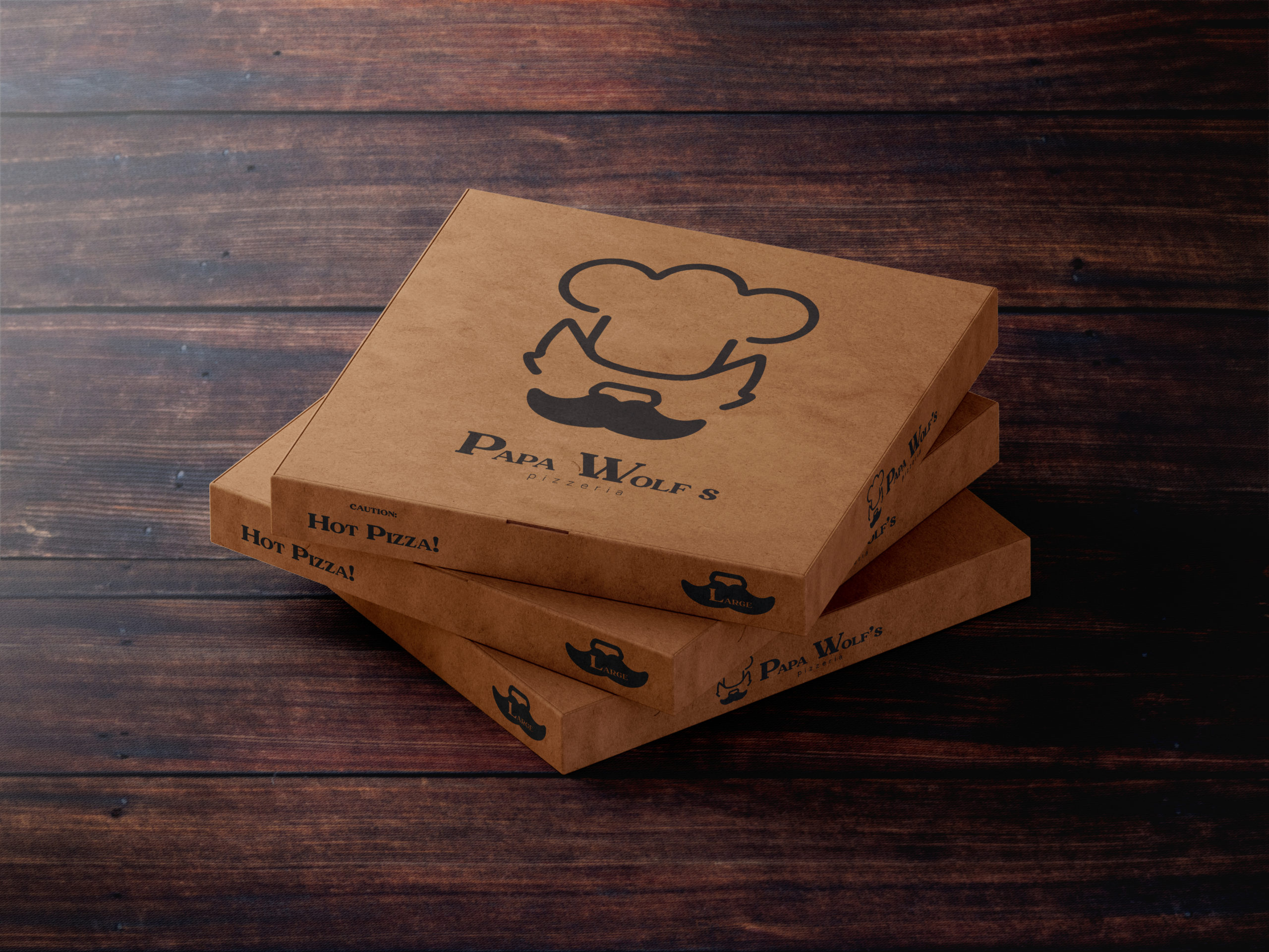
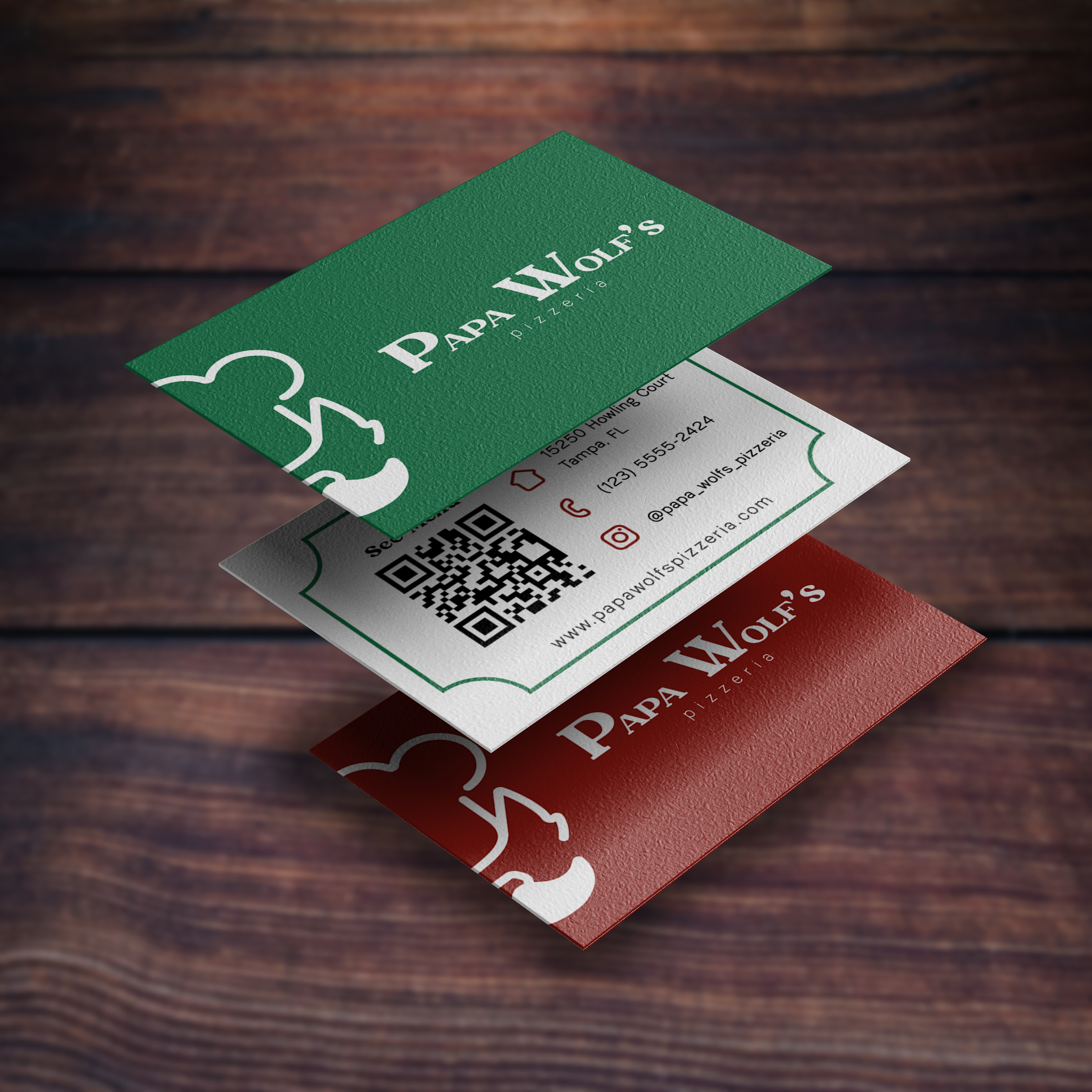
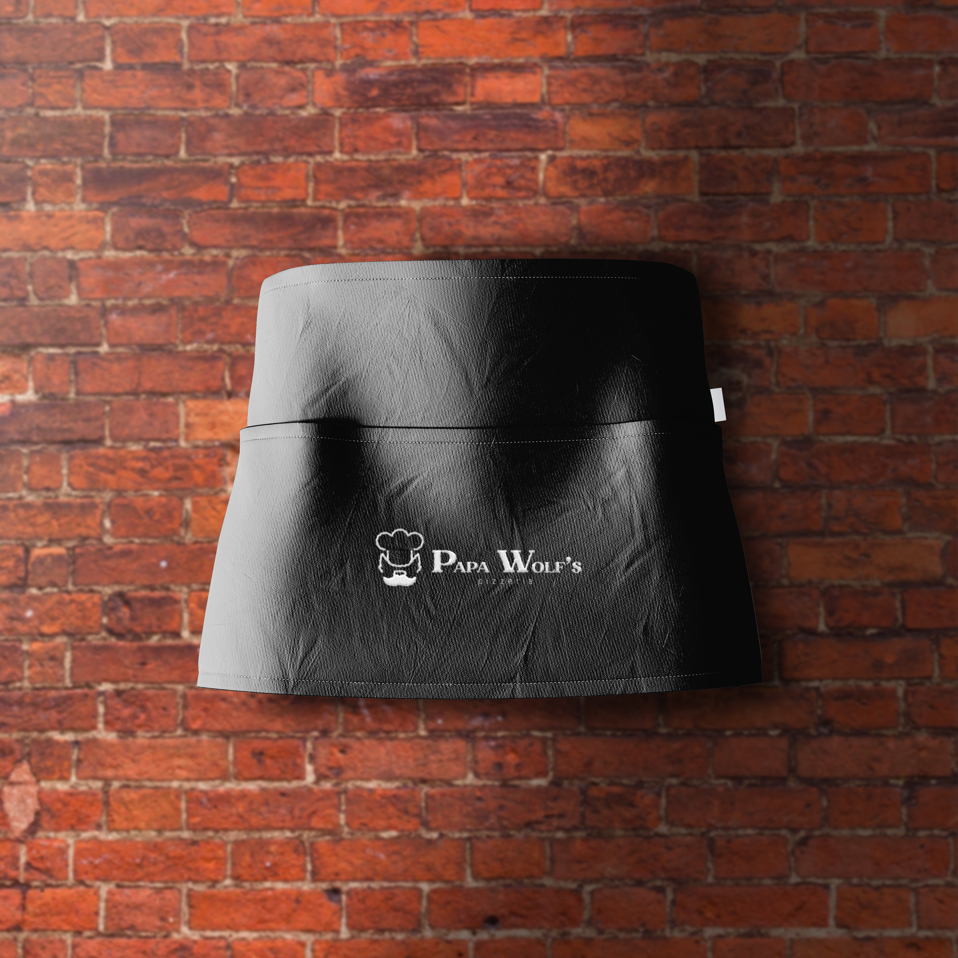
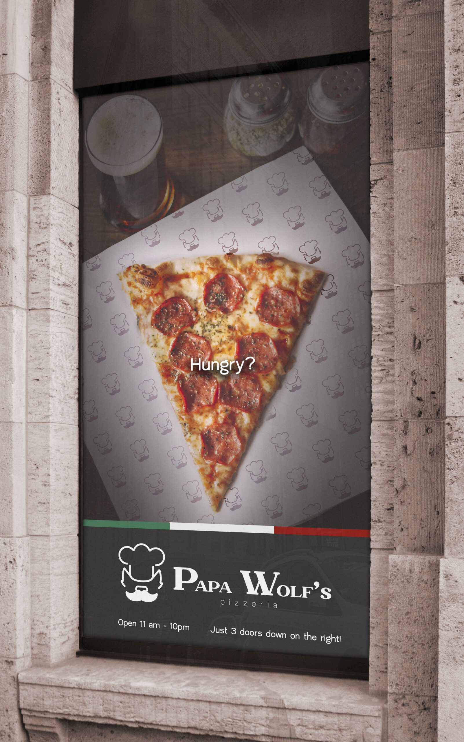
The inspiration started with the name. A wolf wearing a chef hat and the iconic puffy Italian mustache was decided to be the was created as the icon. To create a simplistic look, reduction was used to see how much could be taken away while still being recognizable for what it was. The solution came to retaining the main components of a wolf (ears and nose) with a simplified mustache and hat in rounded lines that have occasional breaks in between to make the icon less static. Finally, the font choice in the logo is influenced by Italian typography with a thinner font for the sub text of “pizzeria”. Staying with the Italian inspiration, the color scheme for the brand was based on the Italian flag of green, white, and red.
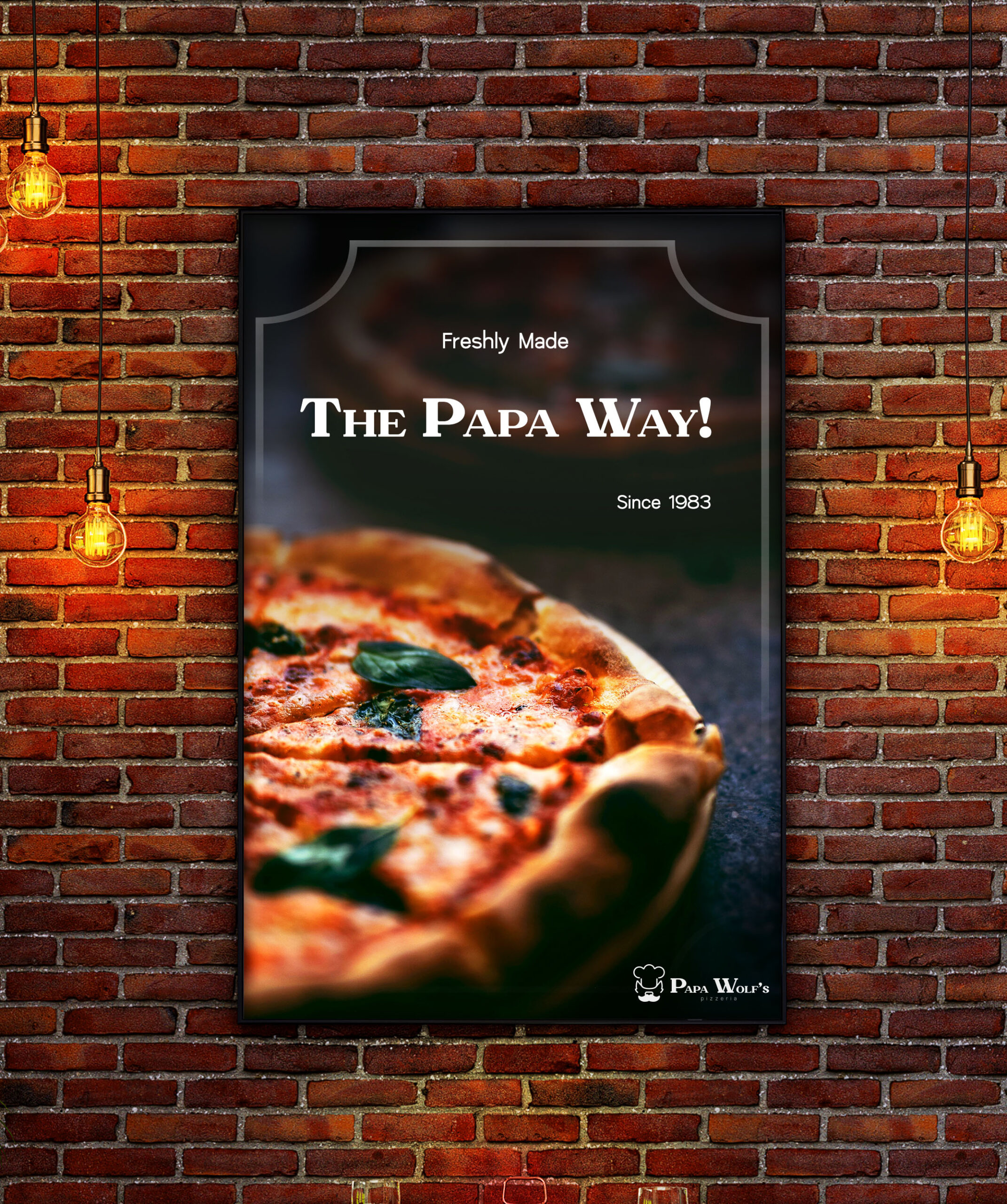
When discussing the interior of the restaurant, it is made to give a warm and inviting feeling. The restaurant would do this by using dark wood paneling and vintage appearing red brick to reflect that of the oven. Speaking of which, the centerpiece of the space is a large brick oven going in the open kitchen. The oven is always burning hot, ready to turn out perfectly crispy and cheesy pizzas.
