Design Rational
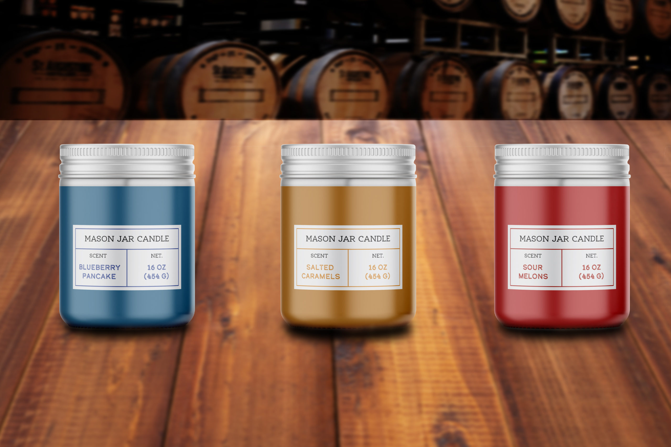
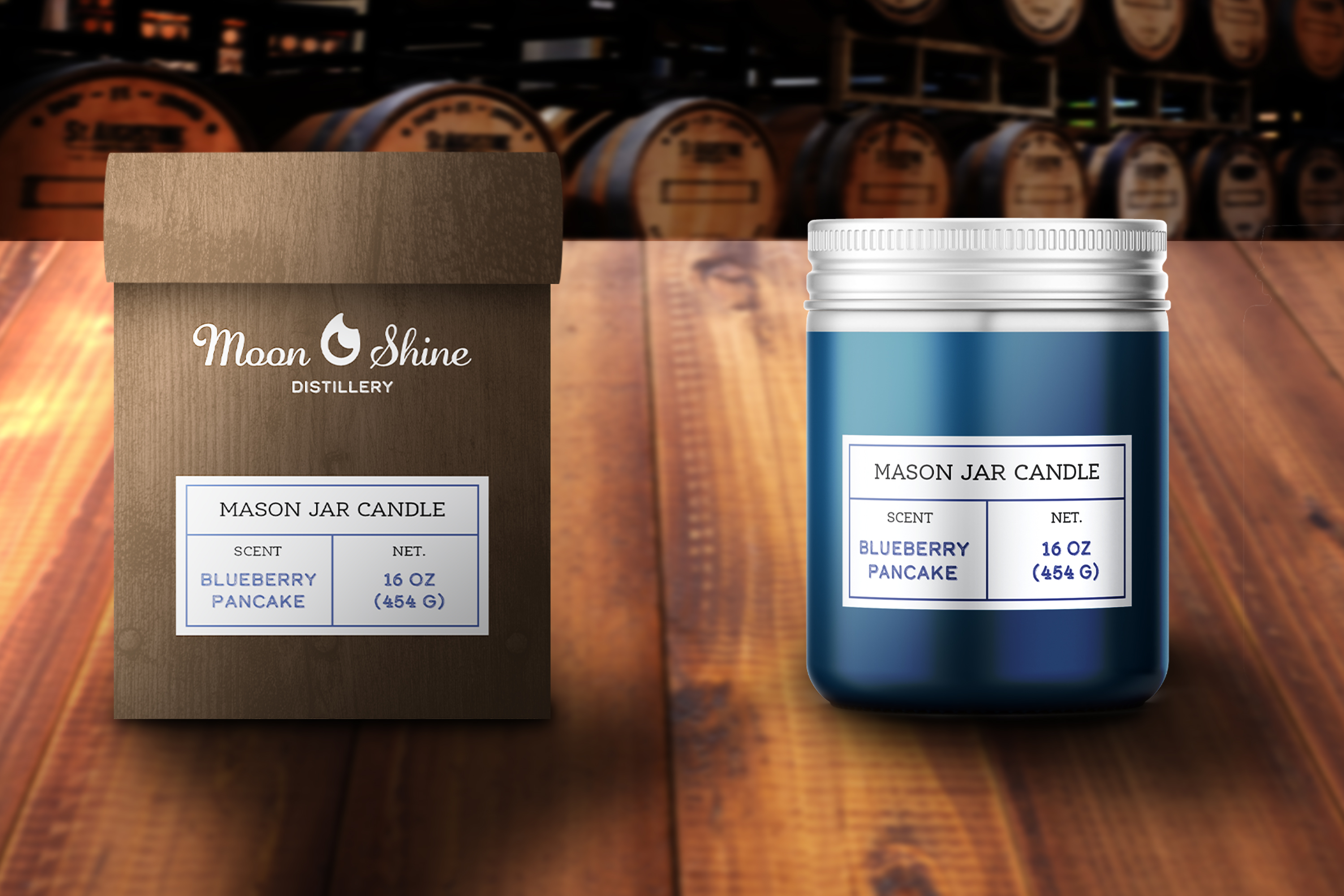
Moon Shine Distillery is a fictitious company that operates in various locations throughout northeast Tennessee, selling alcoholic beverages and souvenirs. This project centers on the development of a new line of mason jar candles that will be available at the souvenir shops within the distilleries.
The main challenge was to create a brand design that evokes the history of the prohibition and the moonshine era while maintaining a modern, simple aesthetic. The target audience for the distillery is adults who are 21 years of age or older, however, souvenirs such as hats, shirts, and now candles can be purchased by anyone.
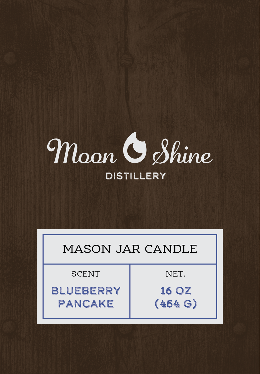
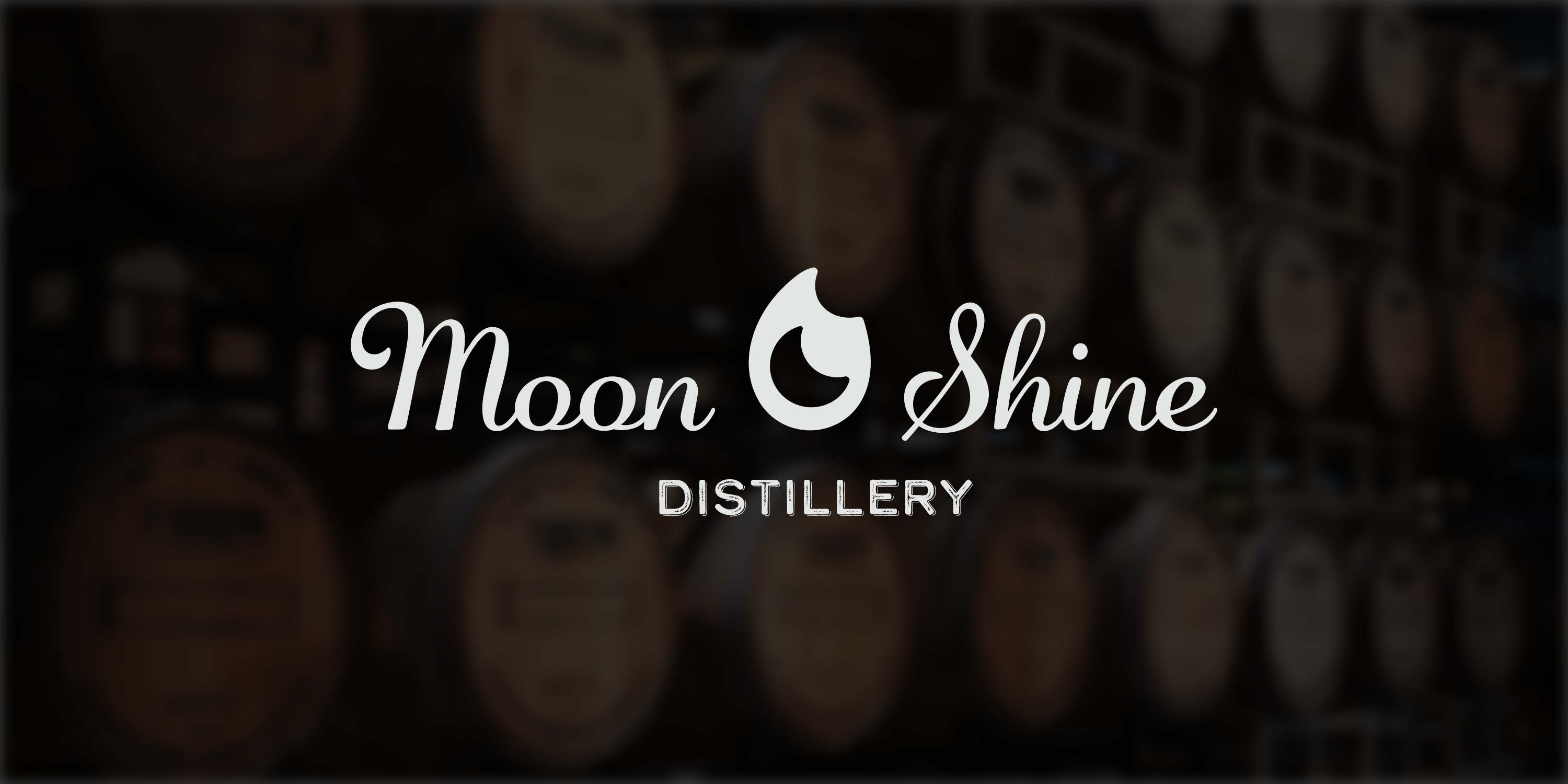
The inspiration for the logo was derived from the name of the company. The official logo icon was created by merging a crescent moon and a flame with the name of the distillery. This simple hidden crescent moon incorporated into the flame was ultimately chosen. The icon is a clean, rounded design that makes use of positive and negative space. For the primary information of the full logo, a script but legible font was chosen for “Moon Shine” and a distressed font was used for the smaller company category of distillery. Both came from the inspiration of prohibition bottle label fonts.
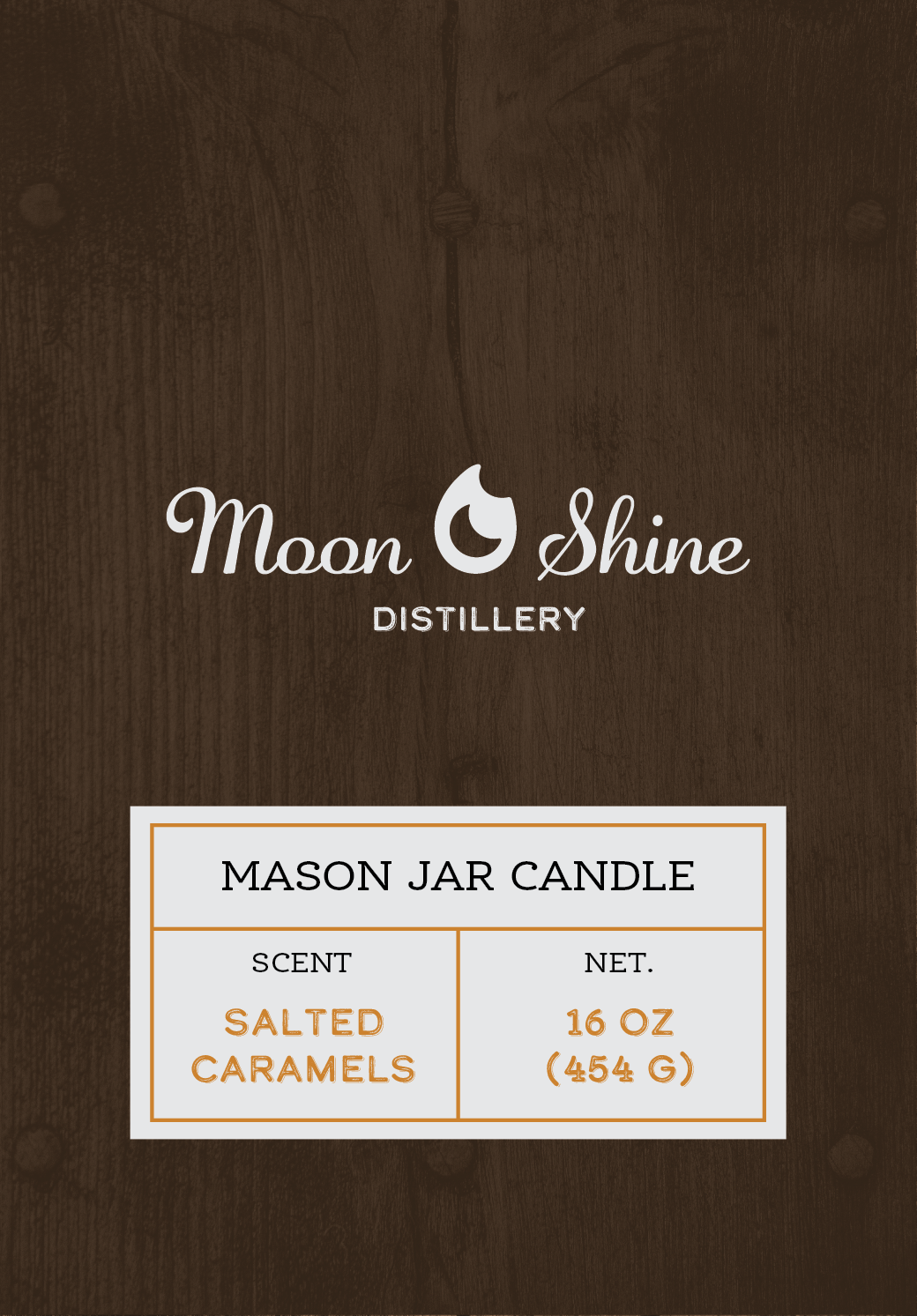
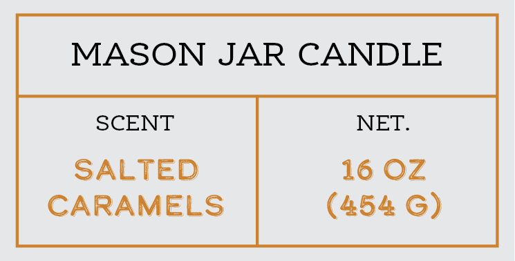
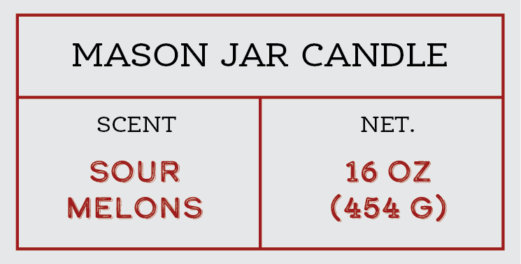
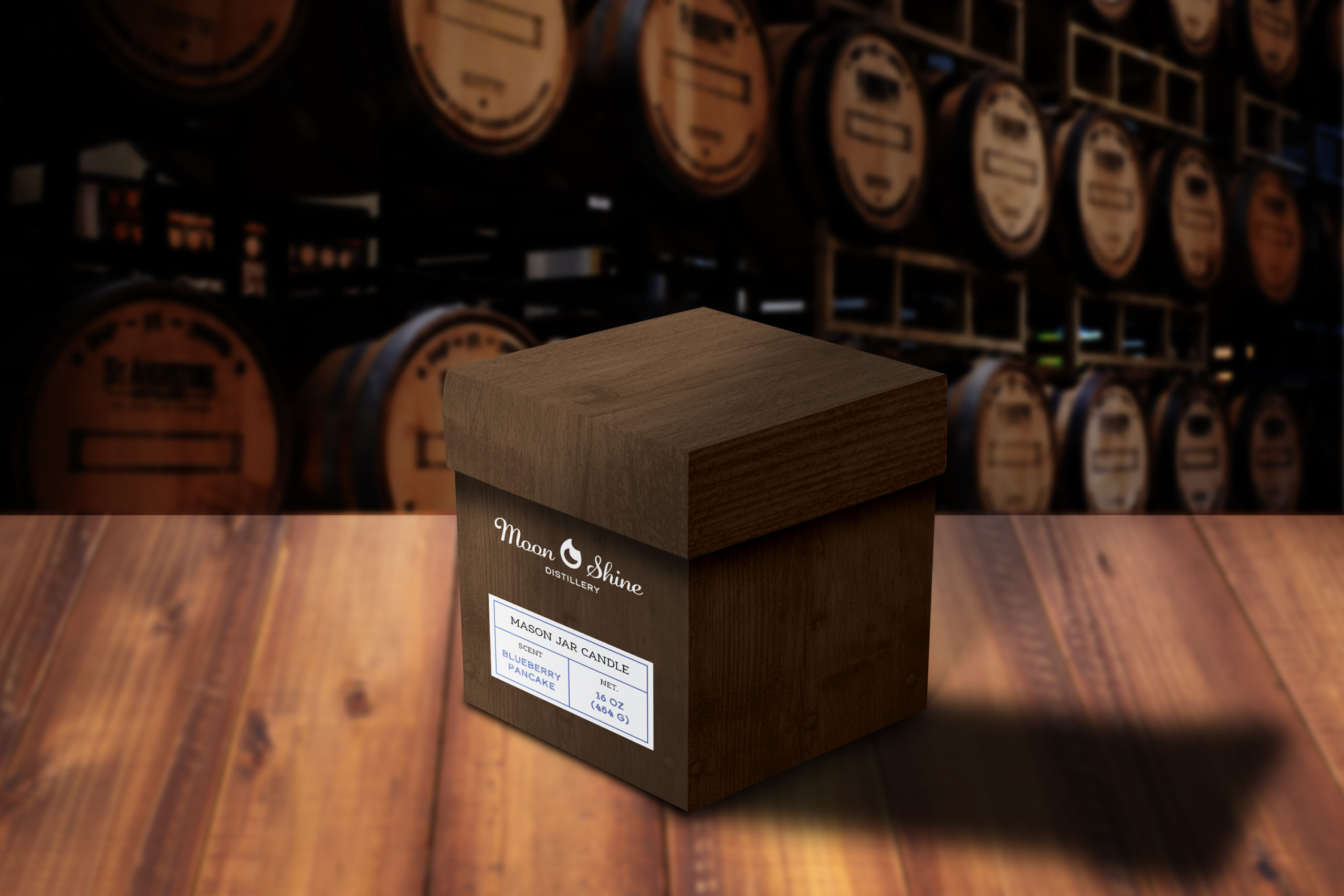
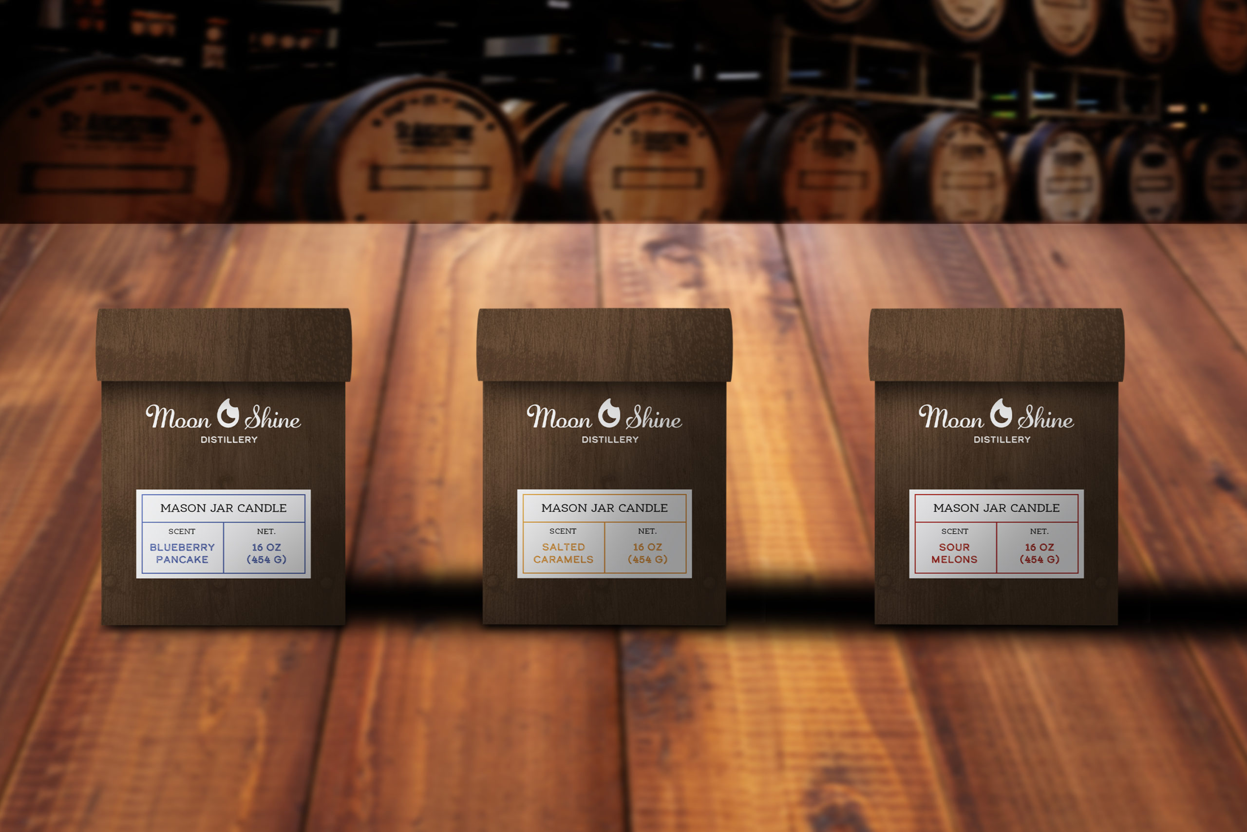
The package design was designed to emulate the wooden crates and labels from the prohibition era. The labels on the front mimic that of the labels of crates for alcohol but instead, swap the information for the candle scent. Overall, Moon Shine Distillery is a company that isn’t afraid to show its moonshiner roots in a modern playful way.
